


A Complete Guide to Colour Basics: Part Two
Welcome to part two of our complete guide to colour basics. Colour plays a pivotal role in interior design, providing depth and texture and accentuating the lines and features of a room's design.
In part one of this complete two-part guide on the basics of colour, we looked at the following:
- Primary colour
- Secondary colours, and
- Tertiary colours
We also explored basic colour concepts, such as:
- Tone
- Shade, and
- Tint
This article will delve deeper into colour concepts and examine the basic colour formulas used in interior design. Read on to learn more.
Concepts on the colour wheel
In interior design, colour defines a room's overall aesthetic and compliments a room's main features.
A colour wheel is a tool that allows you to see the colours in all their shades, tints and tones as they shift from one part of the colour spectrum to another. Below are some colour concepts that may help you decide on a colour scheme for your interior design project.
Warm colours
Warm colours are used to make rooms feel cosy, intimate, and relaxed. These colours generally include:
- Reds
- Oranges
- Yellows
- Golds
- Beiges
- Creamy neutrals
- Browns
- Tans
- and more
These colours are often used in common social areas, like lounge rooms, kitchens and dining rooms.
Cool colours
Cool colours create a calm, relaxing and refreshing feel and often include colours such as:
- Blues
- Greens
- Magentas
- Aquas
- Purples
- Violets
- and more
Rooms that commonly feature cool colours include bedrooms, bathrooms, private rooms (like meditation or yoga spaces), and home offices.
Colour schemes
Creating a colour scheme will depend on the style or "vibe" you want to present in your decor. In part one of our complete colour basics guide, we covered concepts like tint, shade and tone, which are important aspects of selecting a colour scheme. Below we will delve deeper into ideas that create an effective colour scheme.
Monochromatic colours
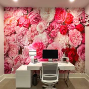
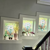
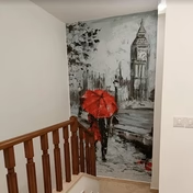
A monochromatic colour scheme often involves using a single colour in different hues, tones, and brightnesses. This is usually achieved by adding whites, blacks and greys to alter a base colour when painting or choosing different tones of a single colour with wallcoverings, like removable wallpaper.
Complimentary colours
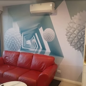
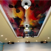
Complimentary colours are used to create a distinct but harmonious contrast—these colours are often found on opposing sides of the colour wheel—for example, blues and yellows or greens and reds.
Analogous colours
Analogous colour schemes incorporate various slices of the colour wheel, usually three, to create deep but complementary contrast in a room's aesthetic—for example, green, blue and purple, or yellow, yellow-green, and blue.
In conclusion
While this colour guide offers a base for creating successful colour schemes in interior design, colour preferences are a personal choice. So get creative, test some colours on paper and create blends for yourself; have fun with your interior design colour journey, and create a space unique to your home or business.
AJ Wallpaper: Endless colour potential for interior design
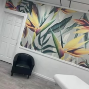
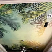
We hope you enjoyed our complete two-part guide to colour basics. If you are looking for the perfect colour scheme for your interior design project, check out our comprehensive removable wallpaper library.
With over one million designs at affordable prices, a range of secure payment options, and fast, reliable shipping to the US, Canada, Australia, New Zealand and Europe, you can get the perfect look in next to no time—so why not browse and buy online today?
Next →
← Previous


Contact Us
Email: info@ajwallpaper.com
Sign Up for our Newsletter
Subscribe to our newsletter and always be the first to hear about what is happening.